-
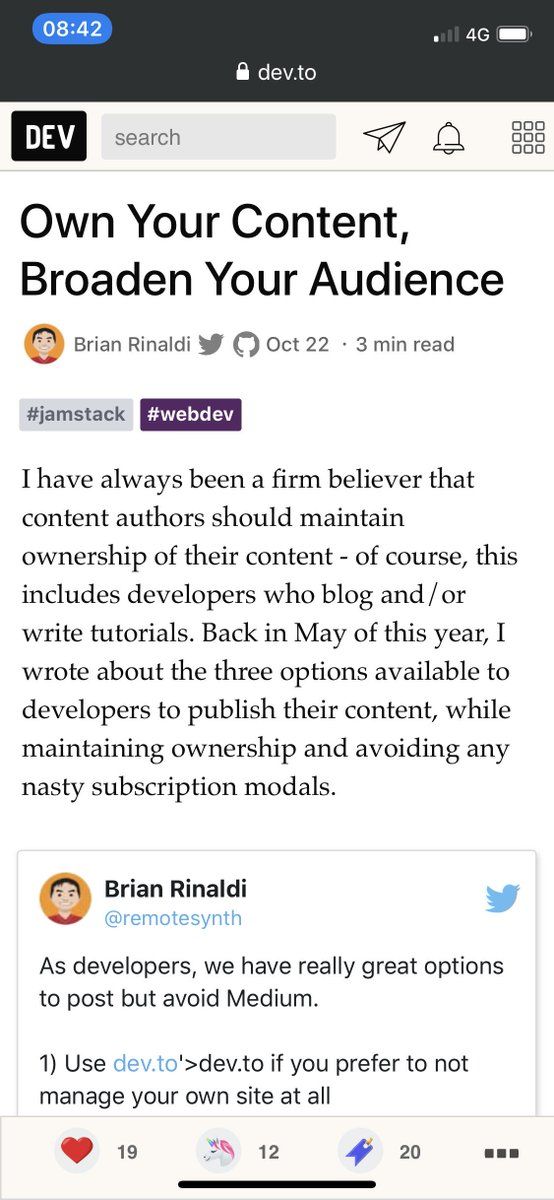
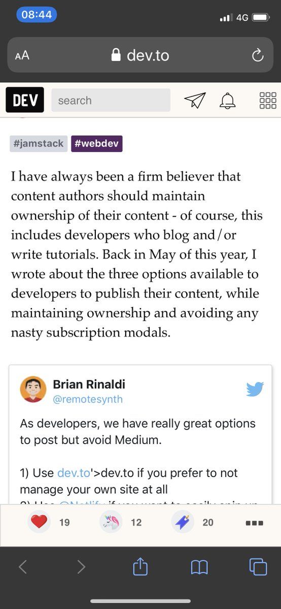
Good idea, but please keep a 50 pixels safe area in the bottom without buttons and links! eventbrite.com/engineering/mobile-safari-why/ @steveschoger/1186330420671057921
-
Good example of what NOT to do on @ThePracticalDev. A touch on one of the buttons in the bottom bar shows the browser interface, it doesn’t add a like, a bookmark, etc. An action hidden behind the […] button requires 3 taps, on different places! 😢 @nhoizey/1186336373072109569
-
@ThePracticalDev If you're still not convinced bottom bar navigation in a website is not a good idea, at least for iOS Safari, read several comments in this @smashingmag article: smashingmagazine.com/2019/08/bottom-navigation-pattern-mobile-web-pages/#comments-bottom-navigation-pattern-mobile-web-pages

